A Practical Guide to Color Theory in Professional Printing
Color plays a central role in how people perceive a design. In professional printing, understanding color theory ensures that the visual impact you see on screen is faithfully reproduced on paper. It’s not only about aesthetics—it’s also about communication, brand identity, and consistency across every printed material.
The Basics of Color in Print
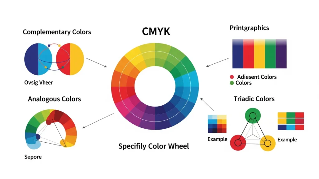
Printing relies on the subtractive CMYK model—cyan, magenta, yellow, and black inks combine to create a wide range of tones. This is different from the RGB model used on screens, which mixes light rather than pigment. The limitation of ink means that not every bright RGB color can be reproduced in CMYK, and designers need to anticipate how their choices will shift when moving from digital to print.
Color Harmony in Design
Professional designers rely on color harmony to create balance and visual flow. Complementary colors (like blue and orange) create contrast and attract attention, while analogous palettes (like blue, teal, and green) are calmer and more cohesive. Triadic schemes—such as red, yellow, and blue—offer balance but require careful use to avoid overwhelming the eye. In print, these choices must also consider ink density and readability on the chosen paper.

The Psychology of Color in Print
Colors carry emotional weight. A vivid red can communicate urgency or passion, while blue builds a sense of trust and authority. Green often suggests growth, sustainability, or health. Black and white, used thoughtfully, can convey elegance or minimalism. In marketing materials, these psychological cues help businesses reinforce their message and connect with their audience.
Professional Practices for Color Accuracy
To achieve reliable results, printers and designers use ICC profiles, calibrated monitors, and test proofs. Paper type plays a crucial role: glossy stocks intensify saturation, while matte papers mute tones for a more understated effect. Consistency across projects is achieved not only through color selection but also through strict file preparation, ensuring CMYK values match the intended design.
Quick Tips for Print Designers
- Always convert colors to CMYK values before sending files to print.
Run a test print to check harmony, legibility, and paper response.