Common Typography Mistakes in Printing and How to Avoid Them
Why Typography Errors Matter
Typography is one of the most underestimated aspects of professional printing. A well-chosen font can elevate a design, while a poor choice—or improper use—can destroy readability and brand impact. Typography errors are not just aesthetic issues; they affect legibility, professionalism, and customer trust.


Print-Specific Challenges
Unlike digital screens, print adds variables such as paper texture, ink absorption, and finishing. Fonts that look sharp on a backlit monitor may appear too thin or even disappear when printed on matte stock. Similarly, spacing that looks acceptable on screen may appear cramped in a brochure. Recognizing these differences is key to producing polished results.
Brand Consistency Risks
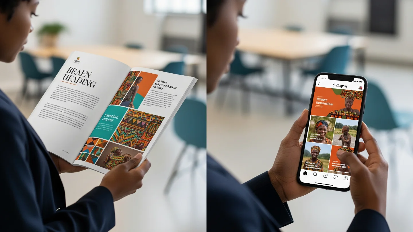
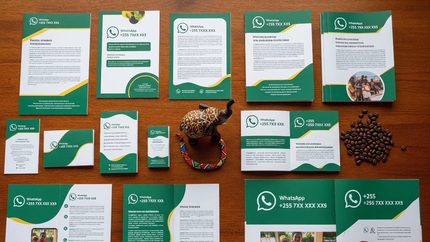
Typography also plays a central role in branding. Using inconsistent fonts across flyers, business cards, and signage weakens recognition. Mixing too many typefaces confuses readers and dilutes brand identity. Professional printing requires discipline: less variety, more consistency.
Mistakes to Avoid
- Using too many typefaces in the same project.
- Printing text below 6 pt without adjusting for legibility.
- Forgetting to embed fonts when exporting files to PDF.
- Choosing decorative fonts for body text, making it hard to read.

Best Practices for Print Typography
- Stick to two or three fonts across all brand materials.
- Test small text on the actual paper stock before mass printing.
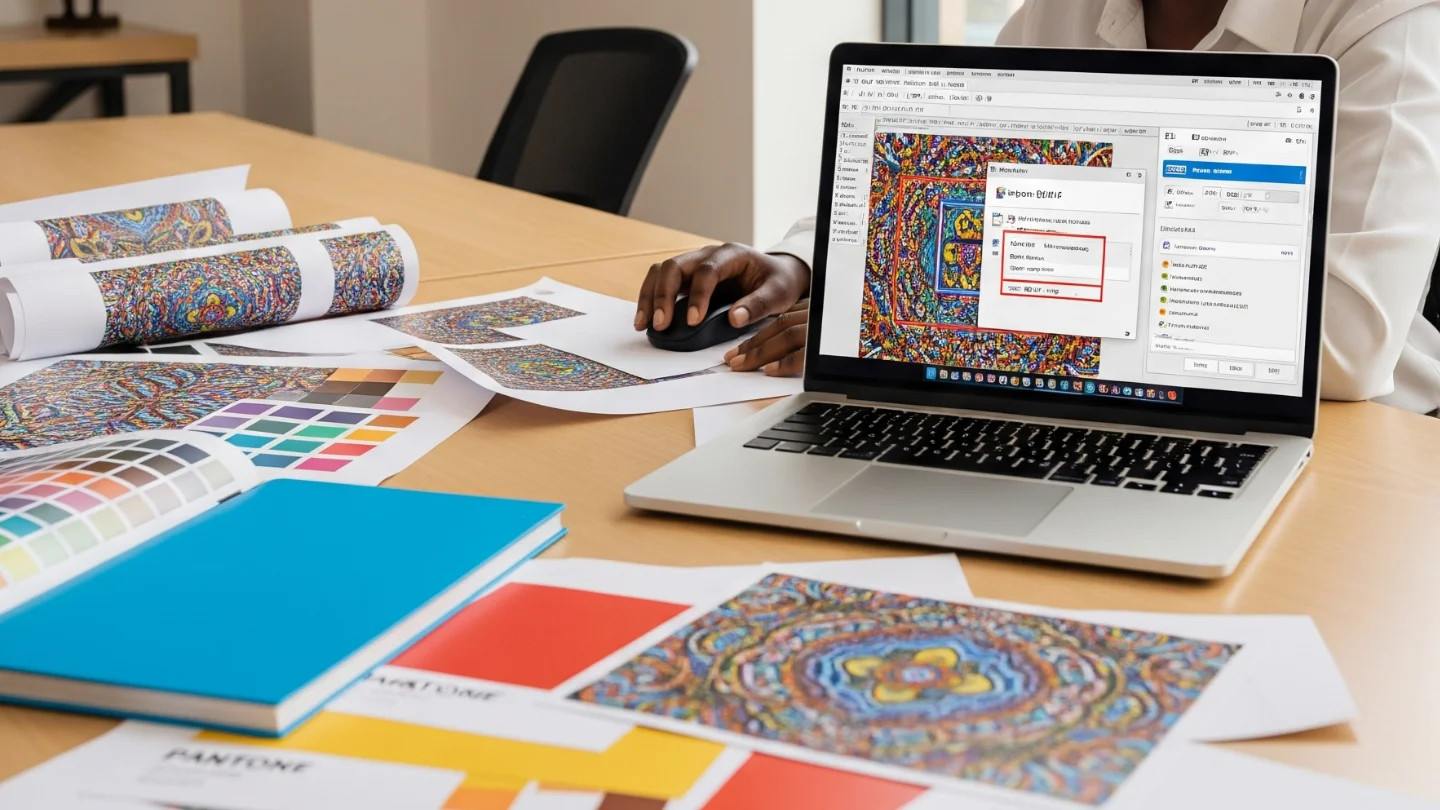
- Use vector-based text (PDF, AI, EPS) to preserve sharpness.
- Always check kerning and line spacing to improve readability.

Practical Checklist for Designers
- Print a test proof for every new project.
- Confirm fonts are licensed and embedded to avoid missing characters.
- Consider how paper finish (matte vs glossy) changes readability.
- Keep consistency: one typeface family for titles, one for body text.